
10 High-CTR Thumbnail Styles That Actually Work in 2026
Most videos don't fail because of the content. They fail because nobody clicks. And most of the time the problem isn't the title, it's the thumbnail.
When someone scrolls through YouTube they're not reading, they're scanning. Your thumbnail has about one second to stand out from everything around it. If it blends into the rest of the feed, the video doesn't get a chance.
A high CTR thumbnail isn't necessarily "beautiful." It's clear, it creates curiosity, and it stands out immediately. That's the whole job.
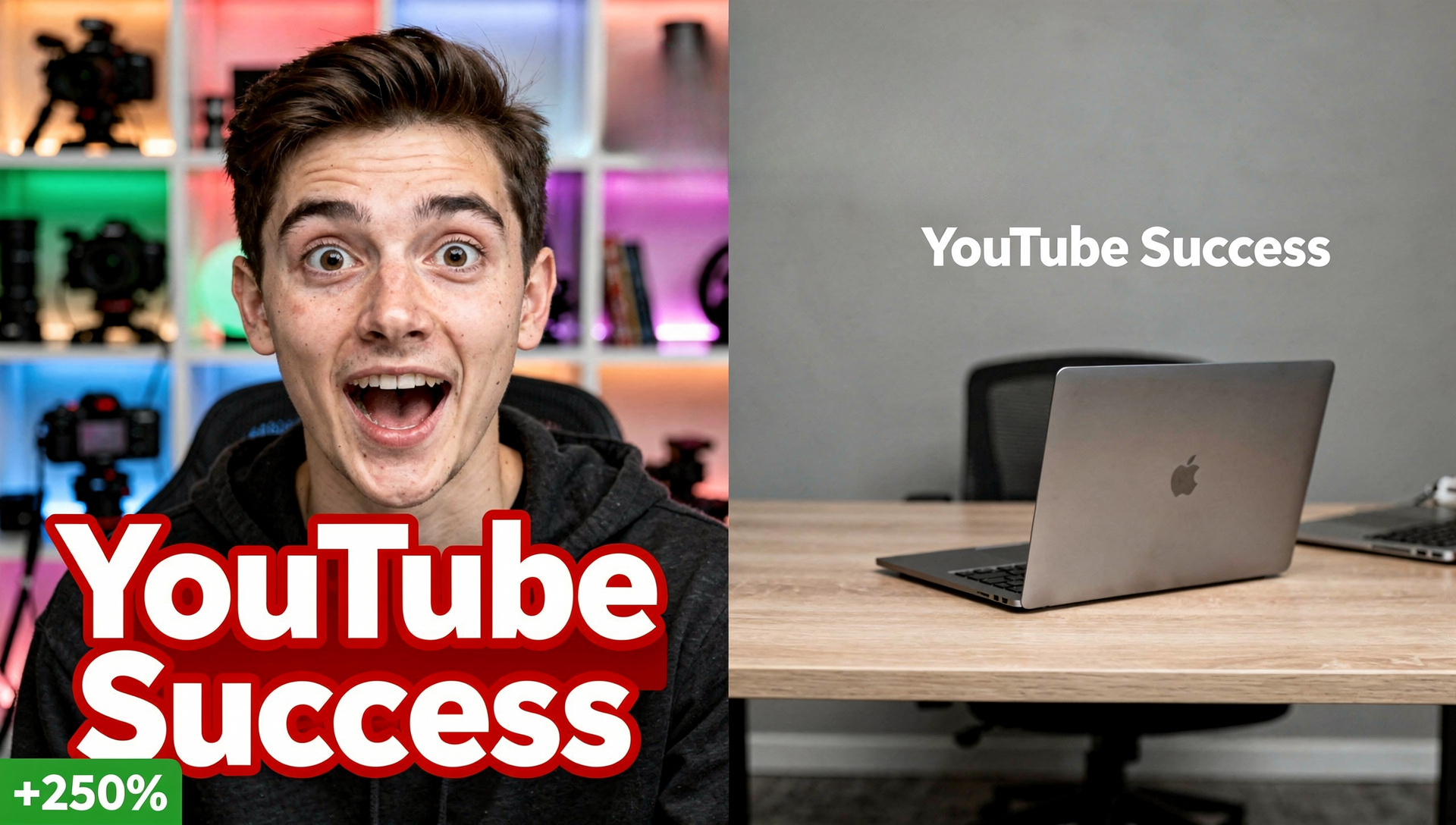
The face reaction
Close-up face with a strong emotion like shock, surprise, or confusion.
Humans react to faces instantly, it's hardwired. This works especially well for tutorials, reactions, and "I tried this" style videos.
The big contrast
Dark vs light. Before vs after. Good vs bad.
Contrast is what grabs attention in a feed full of similar looking thumbnails. If everything in your image looks roughly the same, nothing stands out and the eye just slides past it.
The minimalist design
One object. Clean background. No clutter.
Less is often more, especially on mobile where most views happen. A single clear subject reads instantly even at a tiny size.
The curiosity gap
Show something incomplete or unclear that makes people want to know more.
People click to resolve a question in their head. If your thumbnail already answers everything there's no reason to click through.
The bold text overlay
2 to 4 words max, big font, high contrast against the background.
Small text doesn't work because nobody zooms in on a thumbnail. If your text overlay needs more than 4 words, it's too much.
The pattern breaker
Do the opposite of what everyone else in your niche is doing.
If everyone in your niche uses the same style of thumbnail, breaking that pattern makes you the odd one out, and the odd one out gets noticed. If everyone is colorful, go dark. If everyone uses faces, try an object instead.
The object focus
Zoom in on one important element instead of showing the whole scene.
Too many elements competing for attention confuses the viewer in that first half second. Pick the single most important thing and make it the entire image.
The color pop
One strong, saturated color against an otherwise neutral background.
The eye is naturally drawn to contrast and color stands out the most against muted backgrounds. Pick one accent color and use it deliberately.
The consistent brand style
Same layout, same colors, same structure across every upload.
This one is underrated. When people start recognizing your thumbnails in their feed they click more often, even before reading the title, because they already trust the source.
The too clean to ignore look
High quality, sharp image, professional feel overall.
Low quality, pixelated, or poorly cropped thumbnails kill trust instantly even if the idea behind them is good. Production quality matters more than people think.
The real goal isn't clicks, it's the right clicks
A thumbnail that tricks people into clicking but doesn't deliver what it promised hurts you more than it helps. If people click and leave within a few seconds, your ranking drops. CTR and retention have to work together for actual growth to happen.
"A great thumbnail gets you the click. A great video keeps the person watching. You need both, and one without the other doesn't move you anywhere."
Why this matters for ranking
The algorithm tests your video by showing the thumbnail to a small audience first. If your thumbnail increases CTR, YouTube gets more data faster, and more data means more chances to prove the video deserves wider distribution. A strong title paired with a strong thumbnail gives the algorithm everything it needs to start pushing your content.
Want more clicks and better rankings?
A great thumbnail is step one. What happens after the click matters just as much. When both align, that's when videos actually start moving.
Get Started →